New camera.
New features.
New AND returning users.
At GoPro I worked on the Marketing and Product Teams to help launch new cameras and new features in our upgraded mobile and desktop apps. We balanced crafting promotions and user experiences that met the needs of both returning users and new ones.
My work involved daily partnerships with product designers and managers, the marketing team, engineers, and UX researchers. We collaborated closely to develop user experiences that were not only clear and easy to navigate, but also delighted our customers and underscored the uniqueness of our brand.
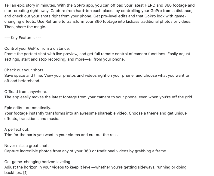
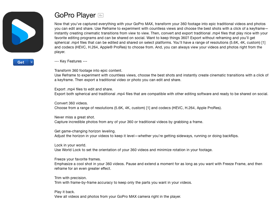
I wrote everything in and about GoPro’s software (including mobile and desktop apps), defining product vision and narratives across multiple platforms and touch points, and tailoring content to different subgroups of our users. I also worked on marketing projects including marketing copy decks, product naming, 2020 copy direction, and promo flyers. Central to every project was understanding the customer problem and mindset.
Testimonials
Working with Katya at GoPro was a fantastic experience. Her ability to take what I wanted to say about our product, and craft it into a message that not only nails the technical elements, but also stays on-brand, is uncanny. Any company looking to hire Katya should know that they will, of course, be getting a great writer. But, they’ll also be getting one who is not afraid to push for what she knows is right.
– Chris Frost, Senior Product ManagerOne of the things I really appreciate about Katya is that she’s always pushing to make things better on all fronts (especially copy and process). A standard bug fix note? Nope. Crashing is for the waves. Hitches in workflow? Not when Katya’s involved. Though not a project manager, she takes initiative to corral team members and get the job done on-time. Katya also volunteers to take on more and asks great questions to get the info she needs to craft solid copy. She brings a lot to the team. I’d happily work with her again.
– Nicole McFadden, Copy Manager
Project Samples
Below are just a few samples of my work, with more available if interested! (Best viewed on desktop.)
In-App Promos: GoPro camera owners (HERO8 + MAX)
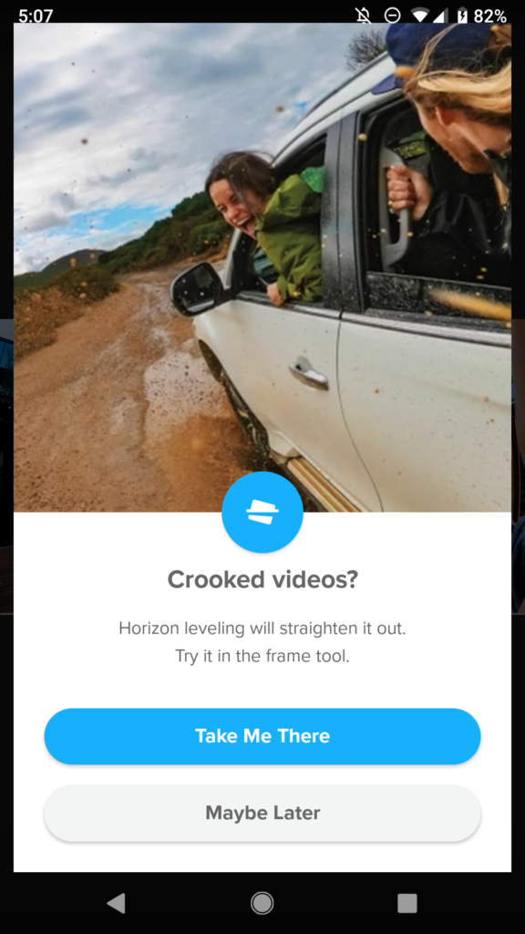
Why: Promote the launch of new editing tool “horizon leveling”
What: In-app promotional interstitial
Who: This promo was specifically shown to GoPro HERO8 and MAX camera owners because the horizon leveling tool is not available in earlier models, or to anyone who does not own a GoPro camera. Most users who see this ad would be returning users.
How: The team needed a pithy way to…
1) Inform users of the new tool
2) Give quick education about what is this tool is and where to find it
We used a catchy interstitial ad. The animation visually demonstrates what horizon leveling does (corrects the horizon line in your footage), and the brief copy elaborates on this to solidify user understanding with minimal cognitive load.
The copy complemented the animation by educating users about 1) the name of the tool, 2) what it generally does, and 3) where to find it in the app.
Details: We took a more creative approach with the copy as this is a promotion, not a functional dialog. The goal is to peak the user’s curiosity and get them to understand the tool just enough to want to tap the CTA and try it out. And the animation instantly demonstrates what the tool does, so cognitive load is minimal.
We chose to show the promo right as users open playback mode in the app because:
– This tool lives in playback mode, so entering this mode is the most relevant moment for informing users of something new here
– We don’t want to interrupt users during a task, so we show this promo before they begin any task here
The CTA takes users to the horizon leveling tool so they can try it and learn it, with little interruption to their experience.
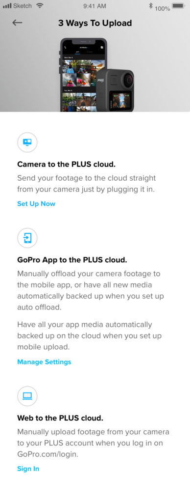
First Time User (FTU) Onboarding: “Reframe” Editing Mode
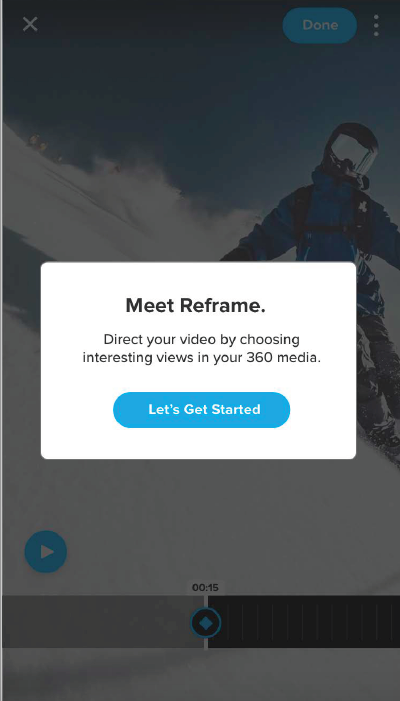
Screenshot of Step 1 in the FTU flow (an educational tutorial for first time users of a new, complex mode in the GoPro mobile & desktop apps).
The Challenge: This was a massive undertaking by the Product Team during my time at GoPro. We had just launched a highly complex editing mode in our app, in sync with the launch of our 360 camera, “MAX.” So we needed to make sure users instantly understood how to use this technology and take advantage of all the 360 camera has to offer.
The Result: This is now the gold standard for onboarding at GoPro.
The Details: The team introduced cutting-edge technology that was unfamiliar to our users. Without proper onboarding few users would understand the new mode or how it allows them to make advanced edits to their 360 footage. So what’s the best way to onboard? What’s the bare minimum we need to show and explain to equip users to take advantage of this novel technology? How much info is too much?
Working with UX designers, researchers, and product management, we were able to conclusively test copy, design, and functionality to iterate and land on an optimal solution. This FTU walkthrough is now considered a best example of user onboarding at GoPro, and the team uses it as a model for future onboarding/educational initiatives.
Testing greatly drove our iterations on copy. I’m happy to discuss details!
Check out the full Reframe FTU here.
In-App Promos: Returning users; mix of GoPro camera owners + non-owners
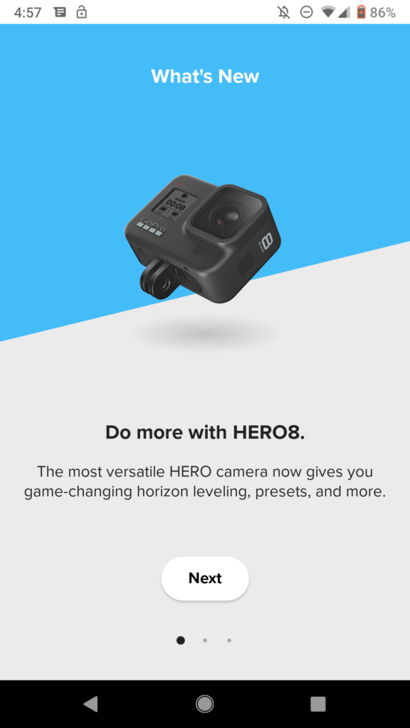
Promo: launch of HERO8 + new app features (carousel, screen 1). Intention is to keep info general and get users to want to know more.
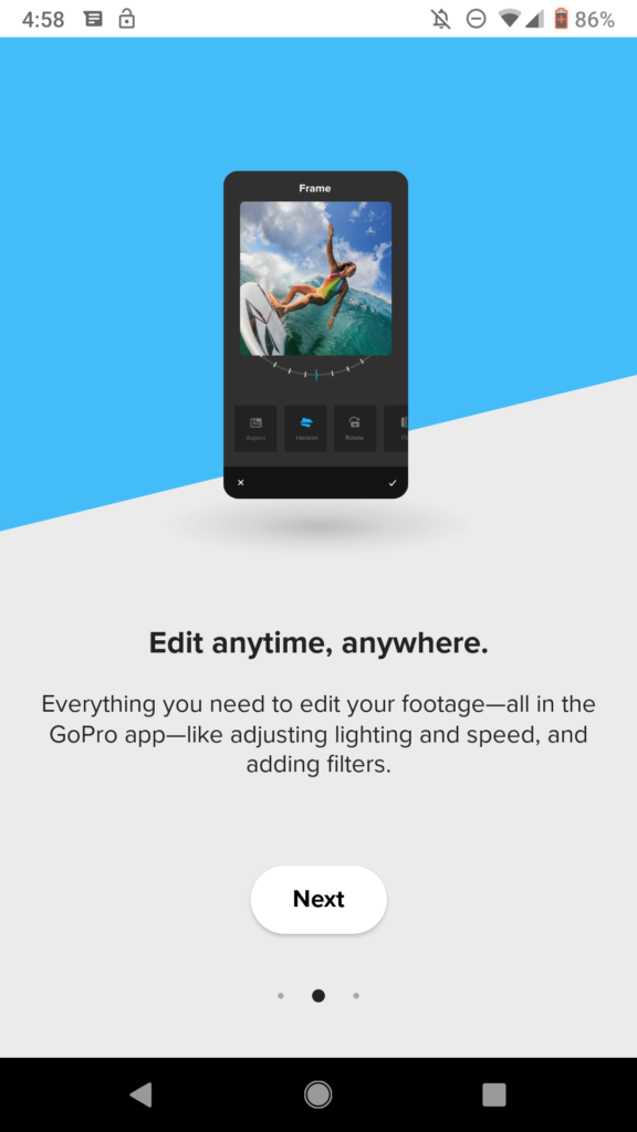
Promo: launch of HERO8 + new app features (carousel, screen 2).
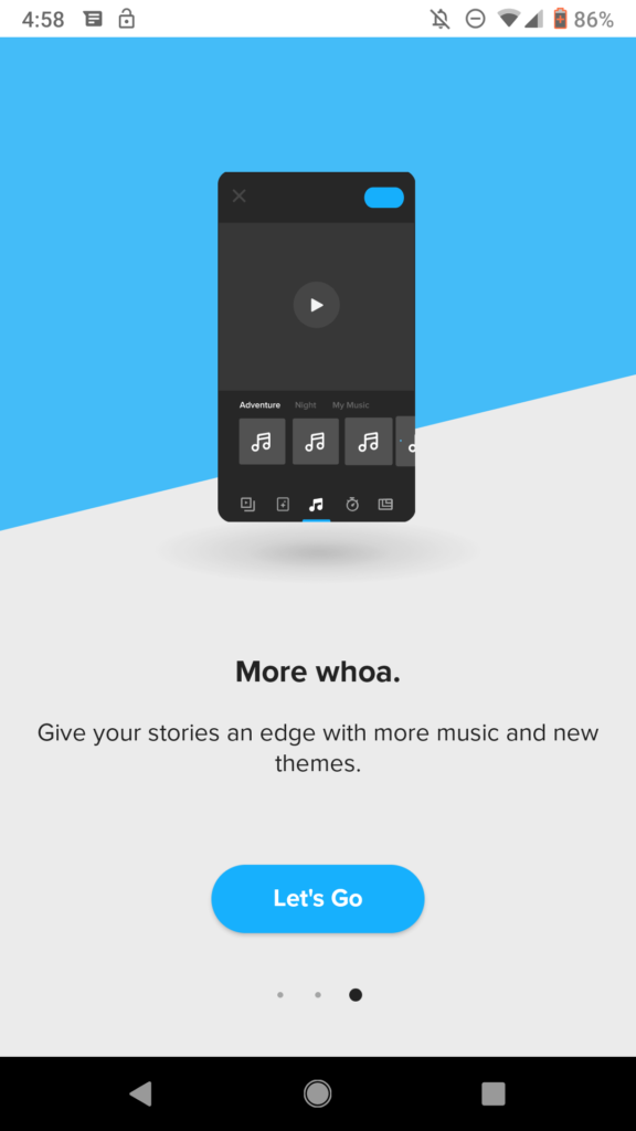
Promo: launch of HERO8 + new app features (carousel, screen 3). Intion is that users are informed on updates and now excited to try out new features.
In-App Promos: Existing users; mix of owners + non-owners
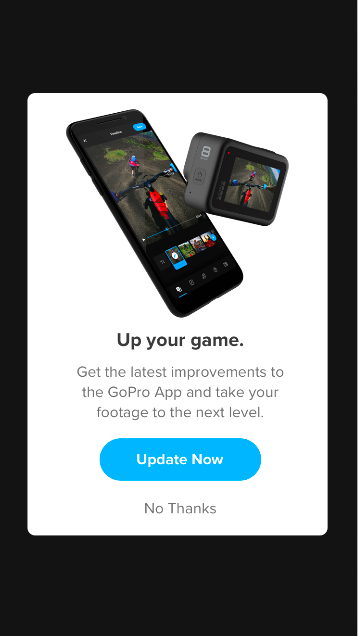
App update reminder (mockup). Alternate line for A/B testing: “Get the latest improvements to the GoPro App and give your footage an edge.” The team was interested in seeing which message would resonate more with our customers.
In-App Promos: Migrating Quik users to GoPro; Non-GoPro owners
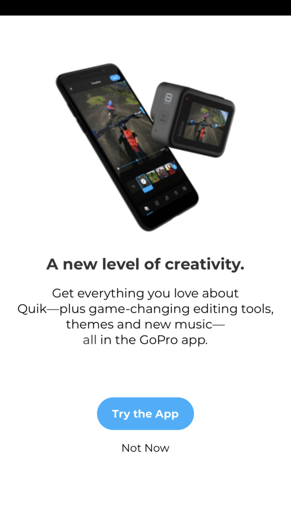
In-app promo for the migration of the Quik app to GoPro. This was phase 1 of our messaging to inform Quik users they should switch to the GoPro app (mockup).
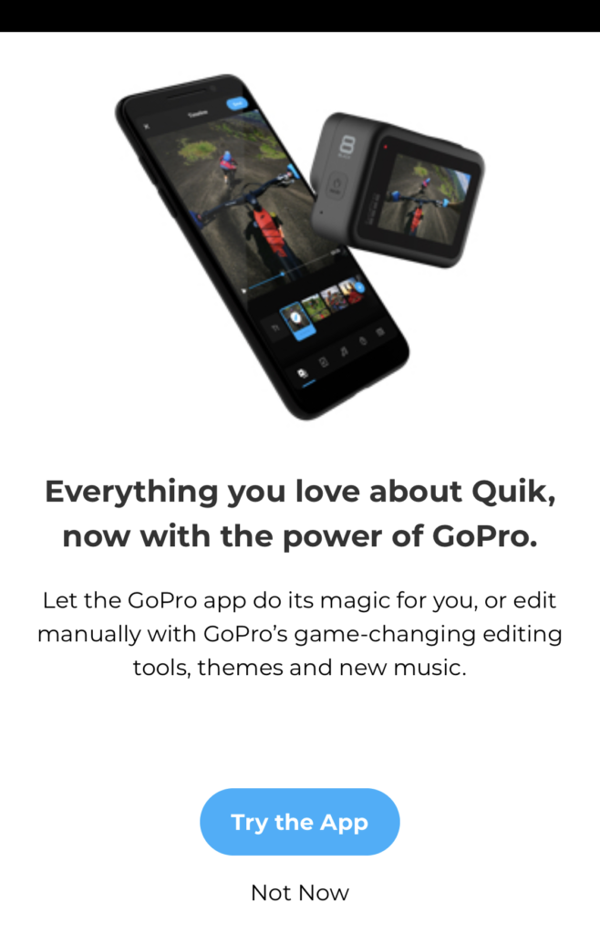
In-app promo for the migration of the Quik app to GoPro (alternate). This was phase 1 of our messaging to inform Quik users they should switch to the GoPro app (mockup).
App Store Product Stories + Release Notes
“Crashing is for the waves, not your apps.”
“Get into trouble, not troubleshooting.”
Those are a couple of my favorite blurbs I’ve written for the app store. Before my time the app updates would simply state “Bug fixes + performance enhancements,” but wouldn’t it be more powerful to talk about these improvements in a way that delights, is memorable, and on-brand?
Below are just some snapshots of the many feature updates I wrote for the app stores. Updates occurred every 2 weeks, so I worked with cross-functional team members to develop a process and schedule to bust these puppies out, get them localized, and get them submitted to the Apple store on time.
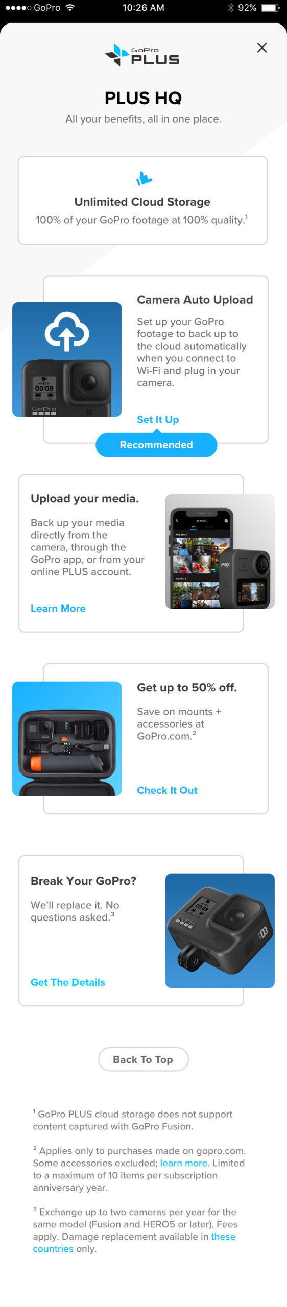
PLUS Subscription Churn Reduction
The team designed a new FTU experience for new PLUS subscribers that:
1) Builds enthusiasm about their new subscription
2) Reminds them of all the benefits they get to make sure they take advantage
3) Keeps users feeling that they get great value each month with their subscription—and that keeping their subscription is a no brainer
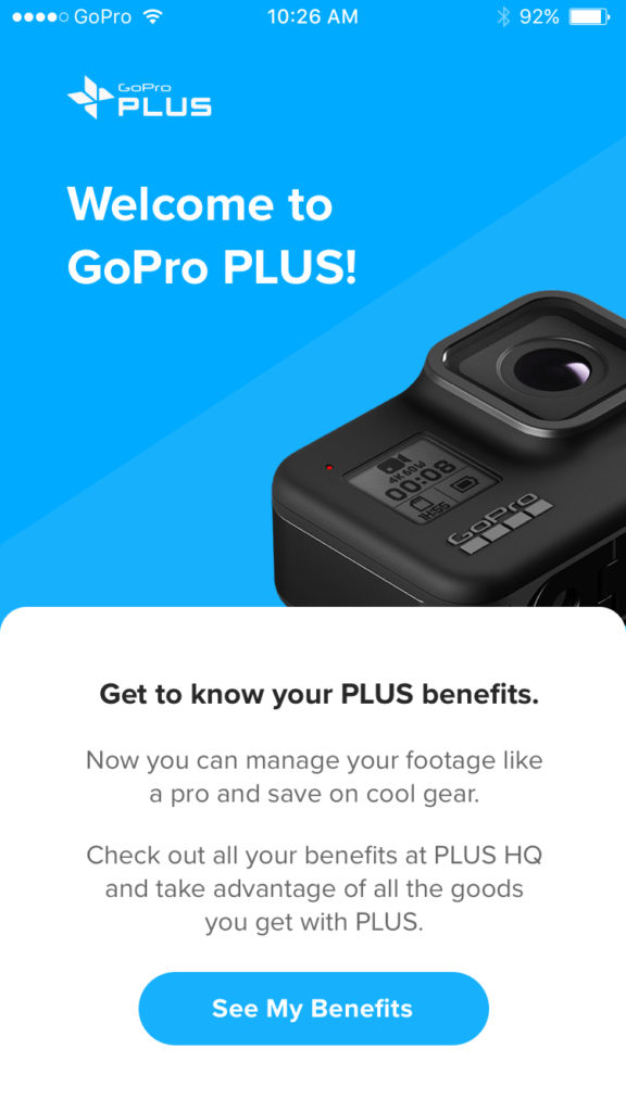
[PLUS churn reduction – Screen 1 (WIP mockups)]
[PLUS churn reduction – Screen 2 (WIP mockups)]
[PLUS churn reduction – Screen 3 (WIP mockups)]