How might we make the right decision crystal clear to our current and prospective customers, so they’d be confident in the next steps of their product experience?
Even more, how can we delight our customers as they undertake an otherwise tenuous task?
These are just some of the underlying problems I would solve through my collaborations across design, strategy, product, and copy teams.
I crafted compelling, clear, intuitive, reassuring, and persuasive copy for the TurboTax monetization initiatives, aligning design with strategy. I collaborated with multiple stakeholders to strategically place the right copy at the right touch points. Copy ranged from headlines, body copy, CTAs, help text, etc. — all of which helped customers choose their upsells and downgrades wisely, so they’d get what they need and feel confident in their choices.
Testing and iteration of designs, messaging, and promotions is at the core of all we do.
I partnered daily with many XFN including product designers, product managers, user researchers, legal, strategy, marketing, technical program managers, and engineers.
Other work at Intuit included helping to craft foundational messaging for the Turbo Household product feature, as the team further builds out this capability. Central to this work was testing our assumptions, i.e.:
- How willing are people to share their debt information with spouses, relatives, business partners, and other collaborators?
- What are their hesitations?
- What does “debt” and “credit” info mean to customers?
- What is the perceived value when they share this info?
These are some of the fundamental questions we tested as we iterated on our messaging, flow design, and feature development.
Work Samples
Here’s some of the work I did for TurboTax.
Curious about a specific use case? Just ask and I can find a sample!
[Note: screenshots do not show the full flow]
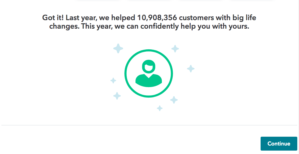
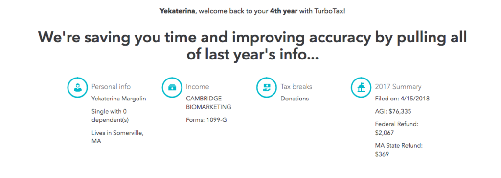
How to remind returning users of the value of staying with TurboTax each year, and prime them for an upsell screen?
→ Quickly re-establish rapport
→ Reinforce how much the user has already invested with brand (i.e. 4 years of data!)
→ Quick hit with value of sticking with TurboTax
→ Reassuring messaging that we’ll take care of you
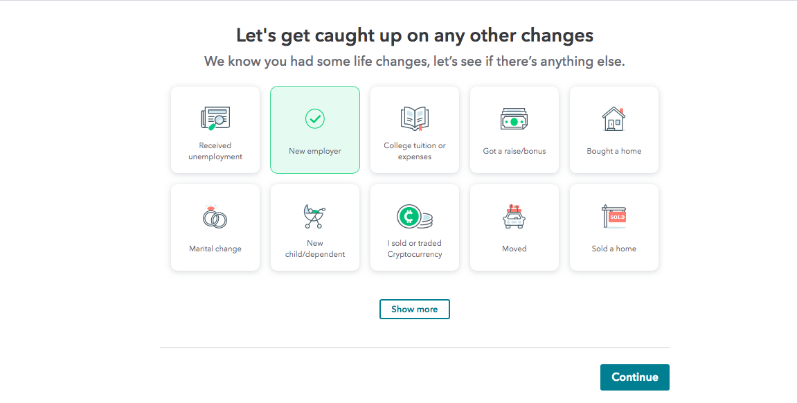
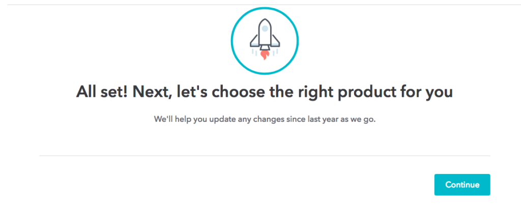
The screens below offer just a snapshot of the full onboarding flow for a returning user.
- We placed upsell screens at strategic points in the flow
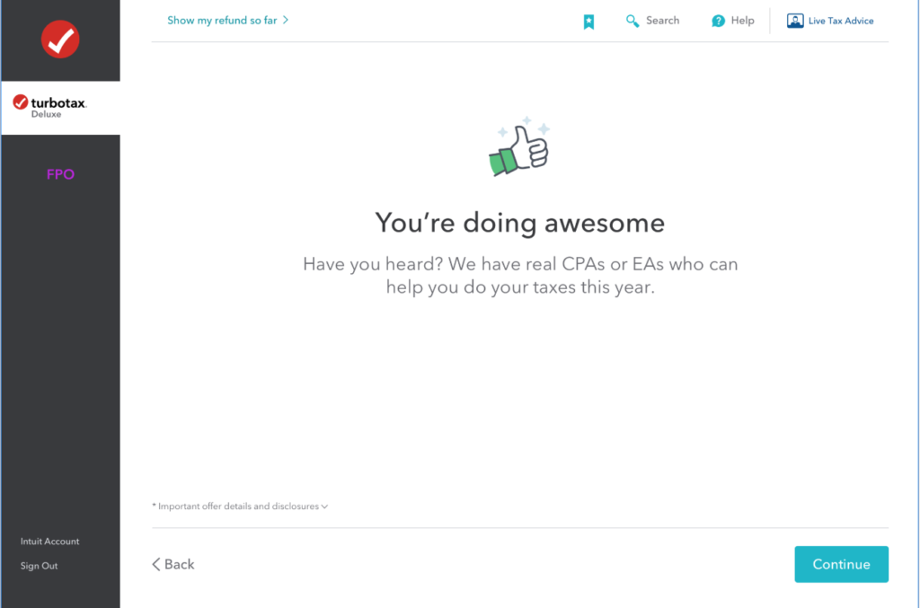
- We created specific screens to cheer on the user through their tax journey and confirm that everything is going well
- Our voice remains consistent, sounding like a reliable friend helping the user through each step
- The tone flexes according to the point in the flow and emotional state of the customer–from reassuring or empathetic to persuasive


[User clicks on “Start for free”]
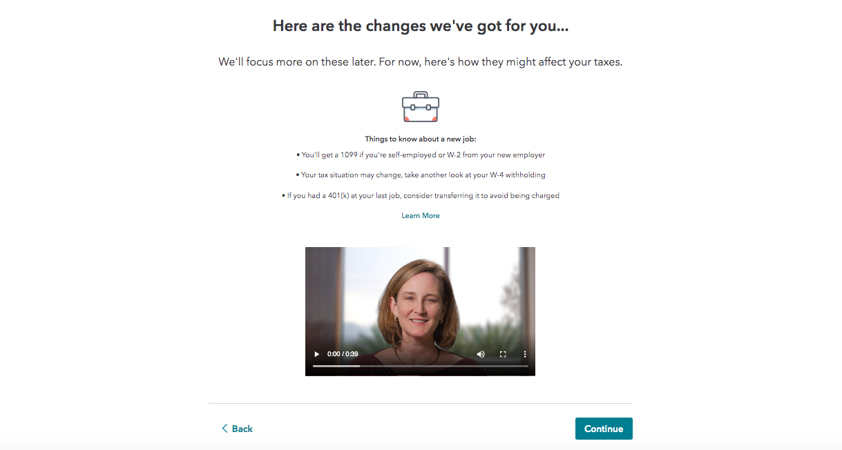
Fast forward in the flow…
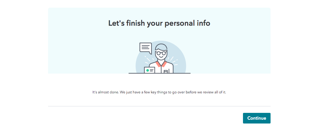
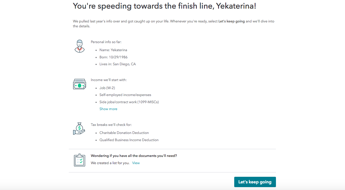
[User clicks “continue” and moves on to filling out personal info before moving on to income (transition shown below).]
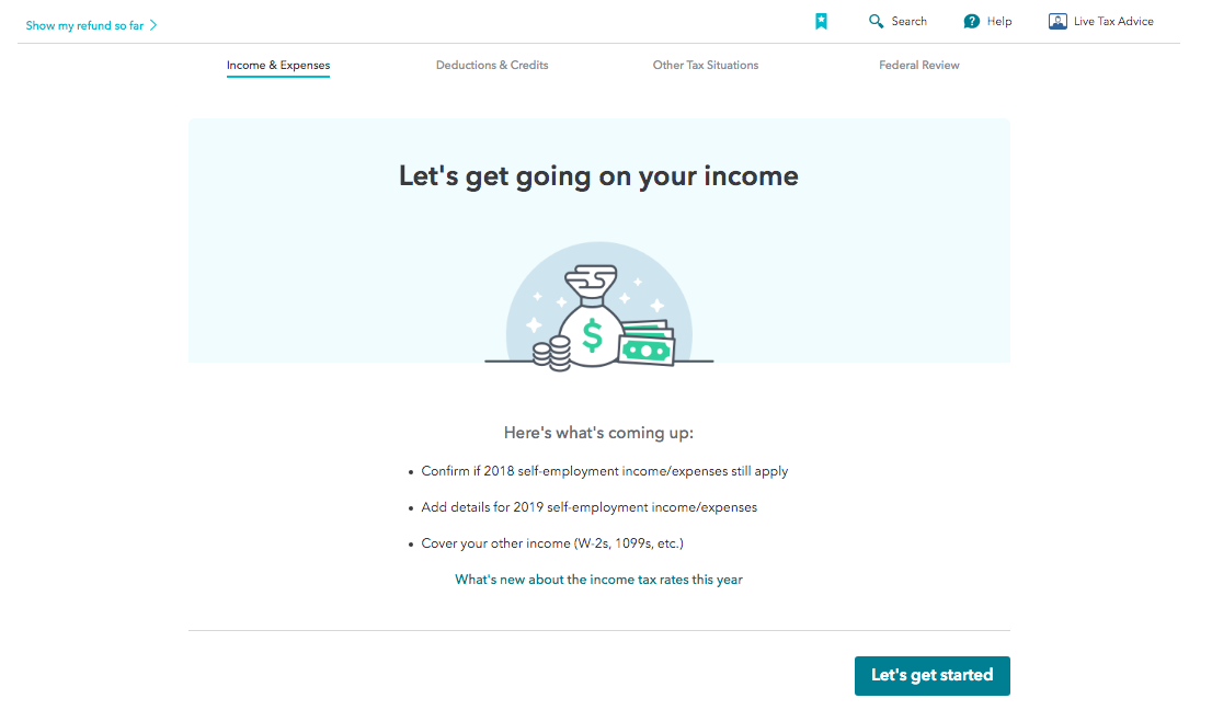
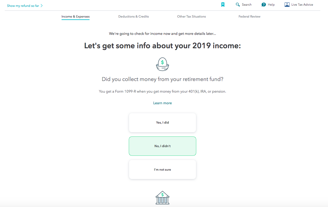
This is just a snapshot of what is a very long flow. All through the journey, we keep a consistent voice—something akin to a friendly coach guiding you along—but we flex the tone as needed depending on the point of the experience. We take something stressful (filing taxes) and make it easy, and dare I say even somewhat pleasant?!
When our users finish the flow, they walk away feeling relief and accomplishment in completing something important, confidence that everything worked and is done accurately, and possibly even grateful for the product and experience we were able to bring them.
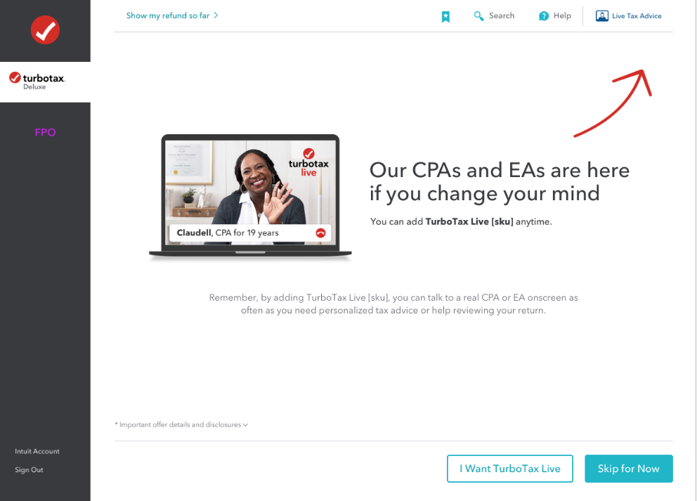
How to show the value of working with our CPAs, and to make this upsell at the right point of the customer experience?
Strategic placement of upsell screen:
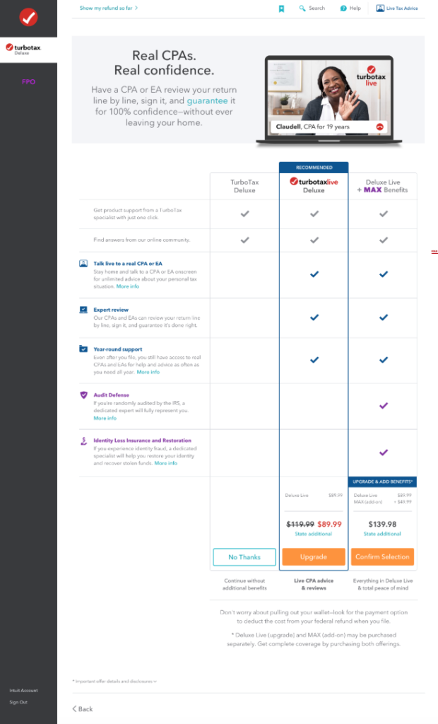
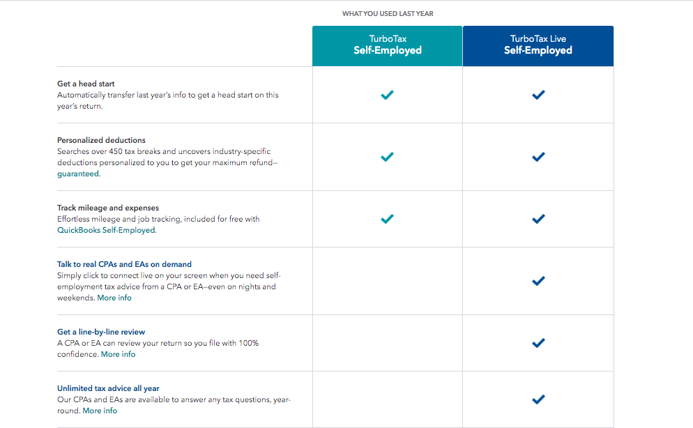
This is an upsell screen within the product flow. TurboTax has several product offerings, but here we show 3 options. These offerings are customized to this specific user based on the tax info they’ve filled out in the flow so far.
- This column makes it easy for customers to compare and contrast the 3 options, and see what trade offs they get
- We help cut through the noise of all the different features by leading with the value prop of the recommended product in the header:
- We prime them for choosing the middle option with messaging here that speaks to the key value prop of this option, so it helps focus their attention
- Decision economics teaches that users prefer the middle of any option, so that’s where we placed the recommended product
- The CTAs give clarity to the different paths they’d choose (rather than just saying “Learn more” each time)
- We add key reminders about the value prop right under the CTAs, at the point of decision
[Legal print at bottom of screen]
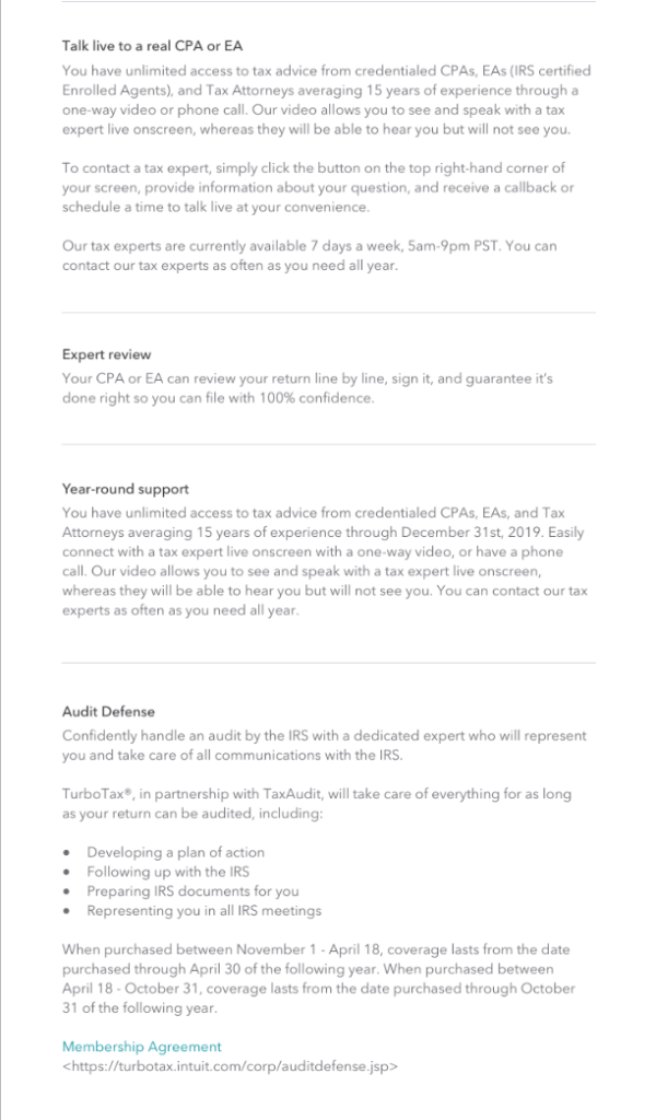
User selects TurboTax Live Deluxe, triggering the confirmation screen:

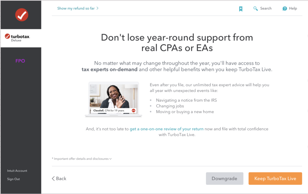
How to keep customers from downgrading and losing product benefits they need?
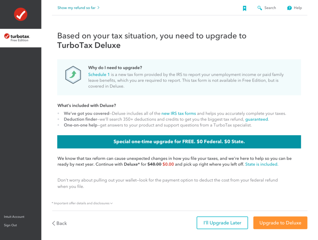
How to explain a one-time free product upgrade, and appease frustration about this requirement?
How to convert an older demographic that may be missing out on the convenience of e-filing their taxes?
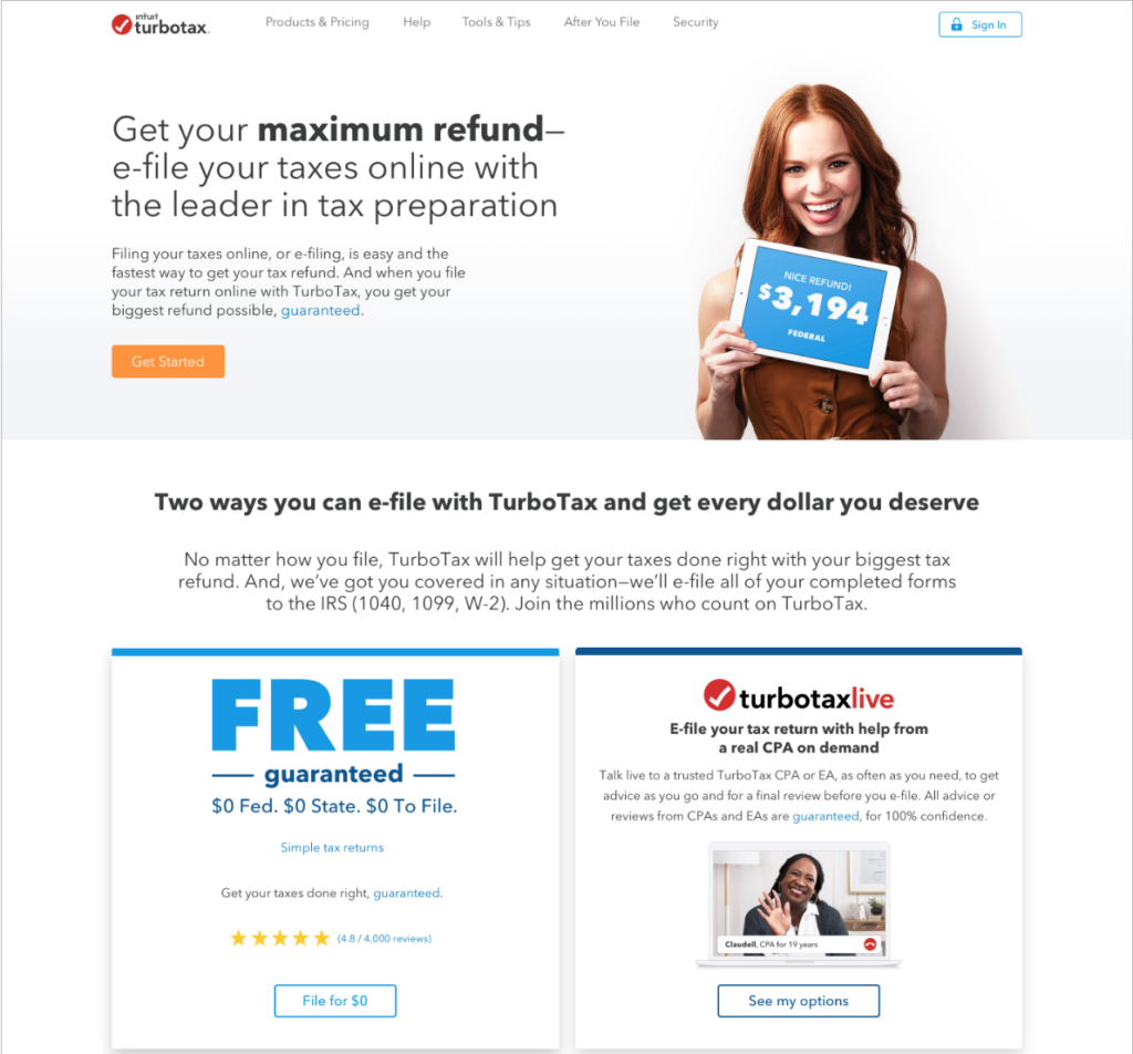
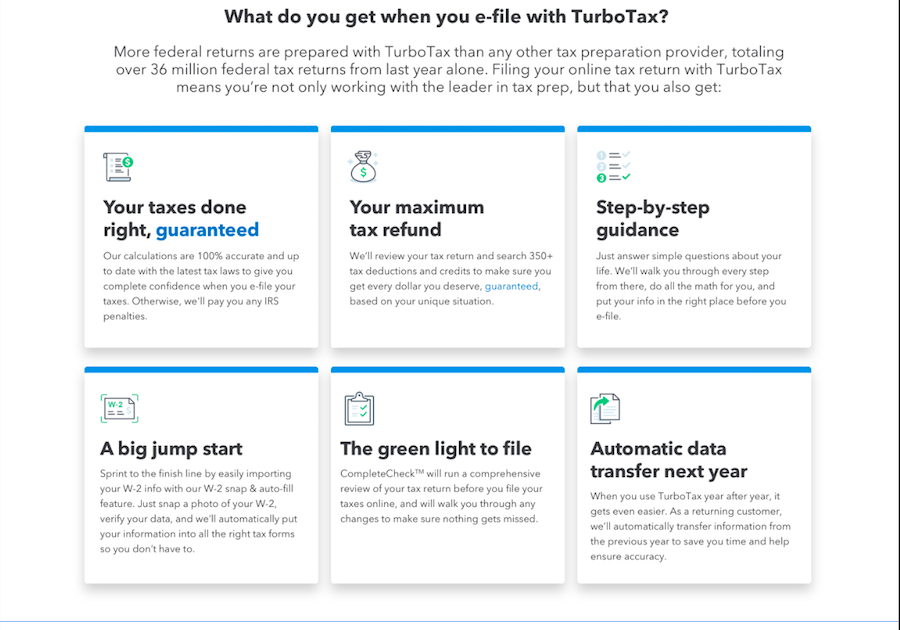
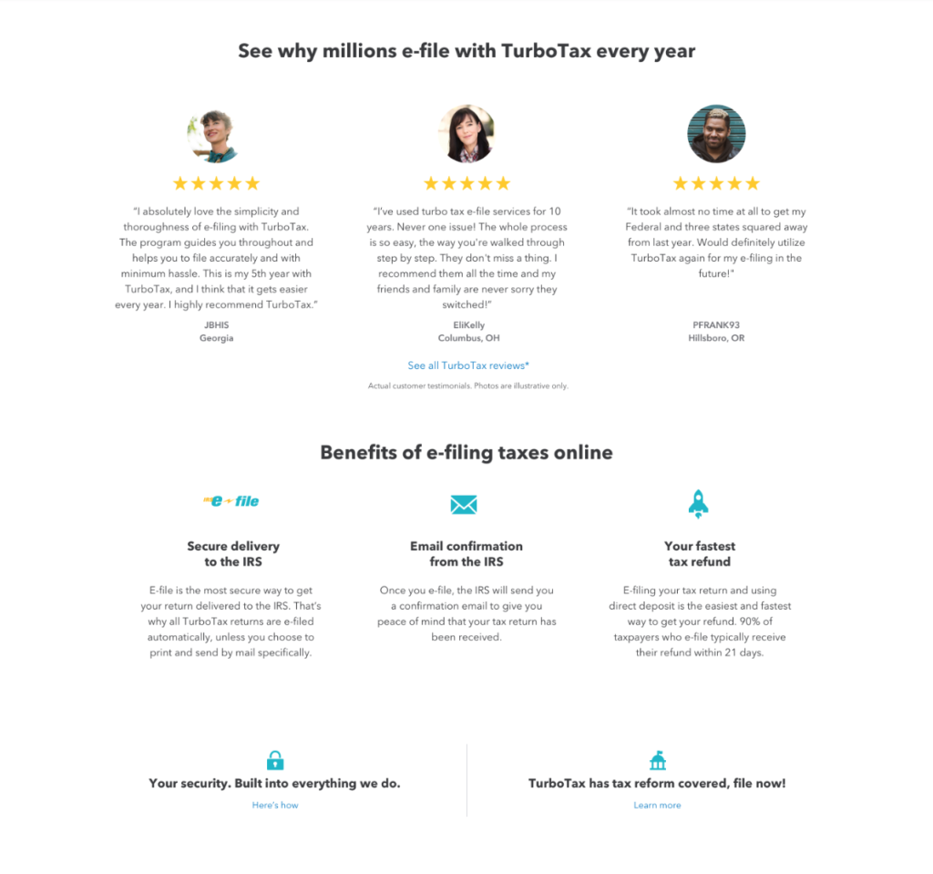
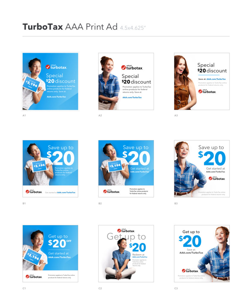
And finally — here’s just a quick n’ dirty ad. (I can write those, too!)
Testimonials
Here’s what some collaborators had to say about working with me:
Whatever project Katya was taking on, she was fully dedicated to delivering. I appreciate that she always provided several viable options, and took feedback well. Katya was very flexible–she helped on different teams wherever she was needed and was able to capture the unique brand tone and style of each product, and flexing content accordingly.
– Nicky Turner, Principal Product Designer
Katya is a self-starter. She gave a fresh approach to crafting messaging for Turbo’s household feature by focusing on the customer mindset, captured the unique brand tone and style of each product, and flexed content accordingly. Katya always responded positively to constructive feedback and implemented feedback effectively. Our team had a great experience working with Katya and appreciate what Katya has brought to the table, and I highly recommend Katya for your project as well.
– Sophia Zhuang, Sr. Technical Program Manager
Katya was a pleasure for me to work with at Intuit. She worked diligently to beat tough timelines and balanced taking ownership of projects and leading collaboration effectively. She stayed positive during stressful projects and communicated project statuses proactively. She is a consistent and up-beat communicator, bringing self motivation and the constructive exchange of ideas to the table in order to delivery quality work. She was dedicated to delivering the best work for herself and for the team.
– Janelle Mancina, Program Manager


