Content designer for 4 years.
Meta Reality Labs.
I help build simple and intuitive user experiences within complex technologies for global audiences.
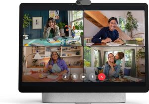
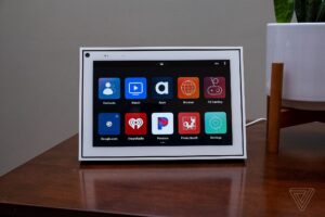
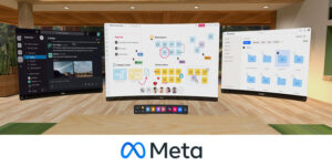
My work has spanned both software and hardware, ensuring continuity across all surfaces.
I worked on apps and features for our consumer product Portal, as well as end-to-end user experiences for Quest for Business customers on the web and in-headset (VR).
Having adapted to ongoing changes in priorities and teams, I brought strategic focus to our explorations, testing, and final designs. I established new information architecture, taxonomies, and content standards. I uncovered and addressed internal knowledge gaps about our own products. And I wrote everything from UI/UX to promotional copy, NUX, onboarding, error messages, notifications, buttons, and much more.
I go beyond words and directly shape UX designs.
I start each project as a thought partner to product designers, engineers, product managers, and other XFN as we think through the problem and potential solutions. I audit existing designs and leverage UXR to inform our approach to new designs or improvements. Working closely with product design and participating in design/content reviews, I go through many iterations to fine-tune the final content. And, being user-centric, I often find ways to improve the UX flow, mock up alternative UI in Figma, and directly shape the final UX designs.
I’m known for asking critical questions, uncovering gaps and risks, championing user needs, aligning partners on tough decisions, and achieving design quality.

Ask me how I:
- Increased user engagement by 83% when I launched quick promotions for various apps and features on Portal, establishing messaging and content standards across teams.
- Developed information architecture, language frameworks, and processes that scale across audiences, product spaces, and immersion levels (2D, VR, MR).
- Aligned with cross-team partners and established language standards that ensured continuity across surfaces, devices, and immersion levels for Quest for Business Admin Center (web) and enterprise vs. consumer headsets (VR).
- Enabled users to navigate across different metrics and to interpret valuable data about their devices and the ROI on their purchase.
At its core my role was about breaking silos, unlocking decisions, reducing risk, aligning XFN partners, and championing user needs for the best possible product and user experience.
NUX Content In-Product: Avatar Creation Step
This was a new user flow for setting up your Quest headset. One of the many steps in that flow is creating your avatar. Quest has experiences both for consumers and for organizations/business, and I was helping to build the business experience. These avatars would be used in VR experiences at work, such as VR meetings.
CHALLENGE
The Quest for Business team needed to adopt the consumer flow for creating avatars, ensuring this content and UX is meeting the unique needs of the work use case, and not just consumer.
SOLUTION
As the content design lead in this product area, I first audited the consumer flow to identify the changes we need to make for our enterprise users, including language, messaging, visuals, and overall UX. I collaborated with many XFN to clarify the technical function of this feature and the parameters of this modal, and to gain UXR insights. This informed my decisions for the content updates, shown below, ensuring we ship a clear UX experience that not only integrates into the larger setup flow but also resonates with users in this specific use case.
Below are the before and after screens. This is the first screen in a multi-step flow for creating your avatar (full flow not available). Once users complete their avatar, they continue to the next section in the bigger Quest setup flow.
Before & After: Screen 1 of Avatar Creation Flow
Original content from consumer flow. The earlier version of this also had avatars with unprofessional attire, which we changed for the business use case per my recommendation.
Updated content I wrote for the business use case. I pushed for a more professional avatar look for the final iteration based on UXR (i.e. remove pink/blue hair).
CONSIDERATIONS
Both the consumer and business flows are creating an avatar for VR, but users have different needs, values, and concerns in the work use case vs. consumer. Key issues with the original screen include:
– UXR revealed work case users do not want to “express themselves” or “showcase personality;” they want to blend in with their coworkers and just be recognized in VR. So while this was tailored messaging for consumer, it did not work at all for the work use case.
– Work users want a more traditional professional look, so some of the visuals here did not resonate in UXR (pink or blue hair; very casual or revealing clothing (not shown here)).
– Footer copy speaks to social apps, so I updated it to speak to the work context.
The original CTA copy set a completely inaccurate expectation of what happens when users select each button, so I updated the copy to fix this. As part of my audit, I had in-depth discussions with XFN to clarify the CTA functionality and what are the different pathways we can offer, revealing that the original CTA language was grossly inaccurate.
We landed on the following content design updates, including updates to the copy as well as the UX and where each button takes users (visual mocks unavailable):
[CTA 1] Edit avatar
[Action/Destination] Starts the selected avatar (as a template) and drives to the Avatar Editor to customize the template.
[CTA 2] Save avatar
[Action / Destination] Creates generic avatar from template and drives to next step in NUX flow.
– UXR showed users care about seeing and approving their avatar for work, so I switched the order of the CTAs from the original, making “Edit avatar” the primary CTA.
– The original CTA copy “Continue” was too vague. It failed to convey that the avatar is 1) being created, and 2) users will enter the avatar customization flow.
[CTA 3] Create later
[Action / Destination] No avatar is created. Drives users to next step in NUX flow.
Language Standards: Quest Device Management
IT admins use the web device manager “Admin Center” to manage Quest headsets in their organization.
CHALLENGE
How might we talk about various actions taken on devices, such as wiping or releasing devices,
ending device sessions, etc.? Particularly when the action is indirect, what language would keep things accurate, concise, and simple?
CONTEXT
Previously, we had considered talking about “sending requests” to devices to perform an action. This is technically accurate: when a user clicks to do something, such as end a session on a device, a request is sent to the device before the session can actually end. The desired action has not been completed just yet, technically. And there could be delays in completing the action, such as if a device is offline.
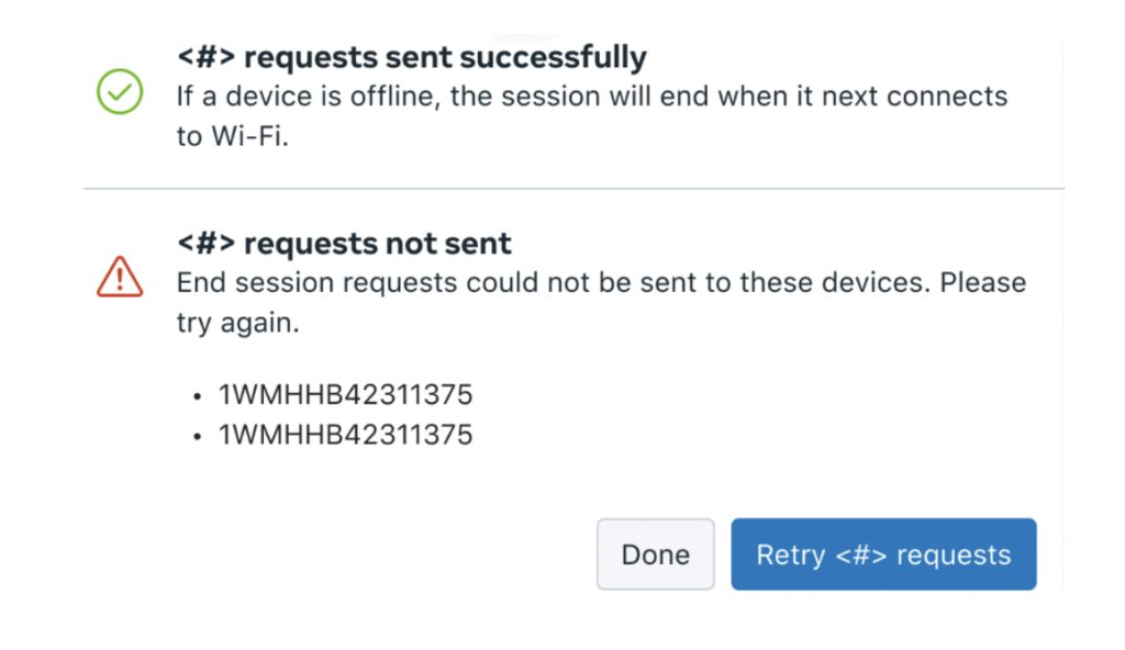
However, this approach has a few drawbacks:
● It is an unnecessarily complicated concept
● High cognitive load for users with little value
● The technical details of how this works do not concern admins. They just want to know that everything is working properly and yielding the intended result.
● The CTA is long, with no value-add beyond the first use when users learn how this works.
SOLUTION: NEW LANGUAGE PATTERN
Focus on the info users actually value/care about.
I pushed to simplify the language by communicating the main information users care about: that everything is working as it should from the action they took (session is ending, device is wiping, etc.). Users don’t need to be bogged down with the technical details of requests being sent, or how the action is not yet complete at that very moment, technically. They just care that everything worked and is yielding the desired result. Skip the technical details.
This brought us to the decision that we’ll communicate what is in the process of happening, without miscommunicating that it’s already complete, and without overloading users with unnecessary information about how it is happening. For example, “session ending” conveys that the session is in the process of ending, or “device wiping” conveys that a device is in the process of wiping.
Also, a localization check confirmed there would be no issues with translating terms such as “session ending” to convey that the action is in the process of being completed.
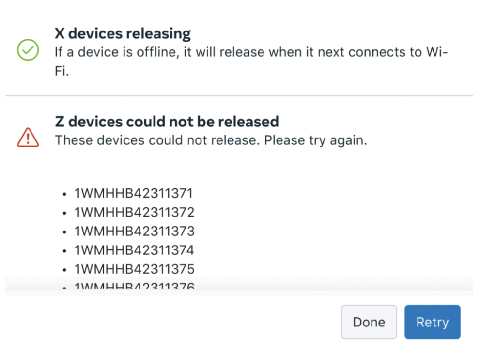
[Modal]


[Toast Notifications]
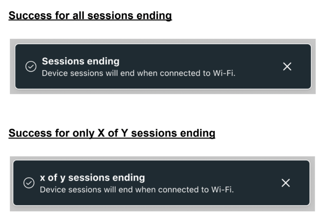
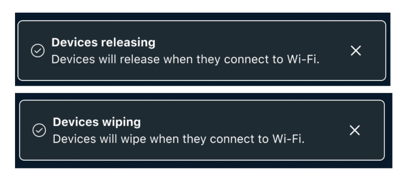
This pattern scales to all other types of device actions across different surfaces.
Here are just a few examples:
[Modals]
[Toast Notifications]
UX Writing Across Device & Mobile
CHALLENGE
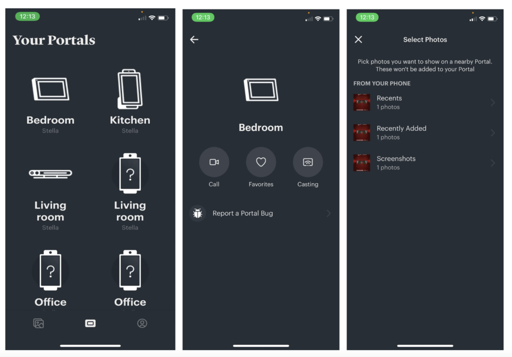
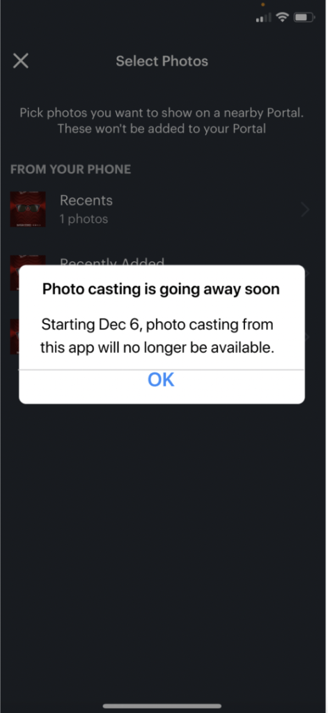
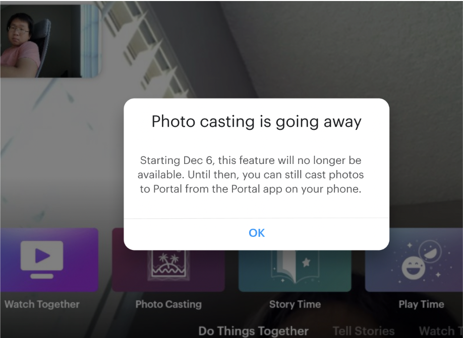
The photo casting feature was going to be deprecated for Portal users. How might we inform users early on to give them time to prepare for this change, and to limit frustration with this news?
[Mobile App Flow: Cast from App to Portal Device]
SOLUTION
Clear and honest info in a modal that is triggered when users open the photo casting feature.
[Mobile App Notification: Feature Sunsetting]
[Portal Device Notification: Feature Sunsetting]
NUX/Education content strategy for Facebook’s Portal
Boost feature discoverability and engagement (up to 83%+) across product teams for Portal.

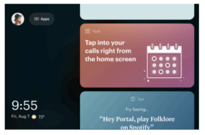
Portal home screen, which always has quick promotion cards to inform and support the user about using Portal, and educate about new apps or features.
WHAT:
I led content design for boosting discovery and usage of 10+ features and apps on Portal.
We created quick promotions (QP) for each feature. QPs are cards that appear on the Portal home screen to inform and support our users. I shipped high-performing QPs that established new processes and standards. This work included content strategy, systems thinking, UX writing, simplification, design systems, messaging and positioning, and extensive XFN collaboration.
Partners: Product design, product management, engineering, UXR, data science, legal, localization/translators, illustrators, and other content designers across teams.
PROBLEM & CHALLENGES:
When I first joined this project team, I asked key questions and quickly realized a few problems:
- The team did not have product knowledge of the features we were designing for (what exactly is this and how does it work?)
- The team did not understand content design and how much “thought work” went into it (ENG or PM drafted a few lines of copy and thought CD would just make some fast copy tweaks. But this draft copy failed to communicate anything about the product, the UX was convoluted, there was no destination for the CTA, etc.)
- The team had not identified the goals of the QP cards, where they should drive the users, or any measures of success (what are we even designing for?)
- The team did not understand the customer or their needs (why would our users care to know about this? Who are we designing for?)
So what is the user problem we’re designing to solve in the first place?
The team did not know. And the exact user problem would be different for each specific feature. So before I could write any copy, I first needed to gather the missing context and answer these critical questions, which would then inform content and product design decisions.
PROCESS & CONSIDERATIONS:
Sync with XFN, audit existing materials, and kick off the project.
As a first step for any project, I book a meeting with all relevant XFN to go over the project details, deliverables, timelines, and any resources we have available. I then audit any project roadmap or PRDs available, as well as any existing content or designs to identify questions or opportunities for improvement. In doing so, I identified a number of issues (noted above) and saw we lacked fundamental context to move forward with our work.
For example, the PM spreadsheet that meant to give context for our work actually lacked critical info. Instead of providing the feature names it listed vague terms such as “Calling 1,” Calling 2,” etc., so we had no idea which actual features these were referring to. There was no description of what the feature is and how it works, what triggers the card to appear to which users, what tapping the card should do/where it drives users, how are we measuring success, etc. So I pushed for finding these answers.


Gather the needed context to unblock CD and PD.
I began by putting on my investigative journalist hat to 1) identify what questions we need answered, and 2) find the right people who could answer them. Since this was a project across many different features owned by separate product teams, I brought my questions to each team to understand what exactly is the feature and how does it work, what are its use cases, and what should I know about their users. Bewilderingly, my questions revealed that many of the features’ own product managers did not understand how these features function, which sent me on a quest of talking to engineers and other XFN to hunt down answers.
Identify the objective of this content.
Once I had the missing context about the feature and users, I needed to think through how to approach these QP cards. This was a rare case in UX when content should lead with the “why” and not the “what” or “how.” I discussed with, and persuaded, my team that these cards have just one job to do: to spark user curiosity to want to know more (and therefore tap on the card). This isn’t the place to educate about the feature; we’ll do that once we get users to want to know more by tapping the card. It took some open debate but ultimately we aligned on the objective of this card, and I pushed for data science collaboration to identify metrics for success.
Crucial conversations, influence the team, and gain buy-in.
I also had some tough, crucial conversations with the team earlier on to educate about what is content design, how much insight and product/technical information is needed to inform CD decisions, and how unrealistic the 2-week timeline was to ship all 20+ QPs given all the dependencies, i.e. it took us more than 2 weeks simply to get context on just a few of these features from their own product teams (XFN replies were slow, especially since they did not know many answers themselves).
These were some of the most tense discussions I’ve led thus far. XFN were surprised and did not like what they were hearing. It helped that I had developed a relationship with our PM from the beginning, who was able to help communicate the value of finding the missing context to inform our work and build QPs that were actually effective.
Through these discussions I made sure to orient us on our shared goals, and to explain why CD was blocked without this context (as well as PD and, ultimately, ENG). It wasn’t easy, but in the end I did get XFN buy-in to my process.
Collaborate, review, iterate, repeat.
My process involved many other XFN discussions in meetings, comment threads in working docs and Figma, and working group chat threads. Sometimes a meeting was better to talk through things. Other times talking in chat was better for a quick sign off or confirmation, especially when facing schedule conflicts.
I explored different approaches to the content, partnered with my product designer on iterations to the card designs, brought content and designs to design reviews as well as team reviews, incorporated feedback, iterated, and landed on a clear and compelling solution.
RESULTS:
The QP cards I launched instantly boosted feature engagement by up to 83%, varying by the feature and were described as “highly effective.”
The project team proudly published a post with project updates sharing this news, with many celebratory comments from partners. I no longer received XFN pushback about my process after that, and the process and practices I had used for this work (and documented) became established as the standards for QP cards moving forward.


EXAMPLE: Launching a new photo feature in video calls
Let’s look at an example of just 1 out of the 10 QP cards I worked on. We were launching a new feature for video calls on Portal. Users could now take photos on video calls, capturing everything in the camera frame (without the clutter of the the screen components). The camera used a complex technology that put everyone’s screens together in a unique way so, rather than just being a screenshot, the photo made it look as though they were all together in the room, creating a “sense of togetherness.”
I also happened to be the content designer on the UX flow of this feature, so I had a deep understanding of its functionality and user mindsets. Here is a high-level snapshot of the feature flow I had worked on:

PROBLEM
User research learned that users wanted photos of their video calls on Portal. They were already using their phones to photograph the Portal screen to “capture moments on video calls on their Portal!” So our team designed a much better way to do this, and now we needed to educate users about 1) this new feature, and about 2) how they could use the voice assistant to take the photo for them, hands-free. The technology is completely unfamiliar so we needed a simple and concise way to explain what it is and how to use it, and at the right touchpoint.
Long story short, this was a completely new technology that wasn’t going to make intuitive sense without some proper introduction.
Before

This is the draft copy I was given for some “quick copy edits” to launch the QP card.
After (Final QP Card)
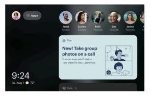
This is the copy and visual concept I developed after many explorations, XFN syncs, looking over UXR insights, content reviews, and iterations. (Just some “quick copy tweaks.”😂) Tapping on the card opens the slideshow.
CHALLENGES
In-call features are more difficult to promote using home cards because:
● Users cannot be directed to the experience in one tap (must make a call first).
● Using the actual experience is dependent on other people being available for a call when the user calls them.
There were also challenges with XFN:
● Project team partners did not understand the role of content design, greatly underestimating the work and investment needed.
● There were no standards, best practices, or processes for the QP cards. But there were many different XFN opinions about it.
● This work was across over a dozen feature/product teams, requiring more XFN alignment than ever before.
PROCESS
Gather context to identify the user problem and the value prop.
After I gathered the context needed to inform content (and product) design, I understood the user problem this feature was solving: users loved sharing special moments on video calls, but they were unable to capture them with photos like they could in person, and trying to do so often disrupted the moment. So my approach to this QP was founded in the feature’s value prop: “Capture the moment, instantly, without interrupting it.” This camera tech enabled them to do just that, so they don’t miss a single special moment (i.e. Families often spent time together on these calls, including toddlers and grandparents).
Voice-enabling was a separate but important, complimentary capability for this feature so users could better capture candid moments, and without the “selfie arm” (the arm that’s in the pic when tapping the button to take the photo).
Now we needed to educate users about this new feature, which isn’t intuitive.
Identify the right messaging for this context. What is saying too much or too little?
We discussed what are the key concepts users need to understand. This is a totally new type of photo technology and some XFN wanted to get into the details of how the tech excludes certain elements from the photo, the real estate of each person’s screen in the photo, and so on. I asked the team to take a pause and think through what’s important to the user. Do they want to overloaded with knowing all the technical details behind the scenes, or do they just want to know what happens and that it worked? We agreed on the latter.
Users need to know the final result of this feature (get unique photos showing you all together as if you’re in the same room), and how to use the feature. They don’t need to know HOW this all happens on a technical level, which would just be unnecessary cognitive load.
Early explorations.
The concept our QP needed to convey was a “sense of togetherness” and “capturing the memory with photos.” I explored many different approaches to the copy, and also guided our illustrator to better think through which visuals could instantly convey this concept and pair well with the copy.
While I typically avoid functional headlines for this type of content, there was an exception in the context of photos. Research showed that users engage very well with direct messaging about taking photos, and our users were eager to do this on their Portal calls, so we knew we wanted to lead with “Now take photos during calls.” But what else should we say beyond that? How should we talk about this technology, and what’s just the right amount of info to educate them in the slideshow?
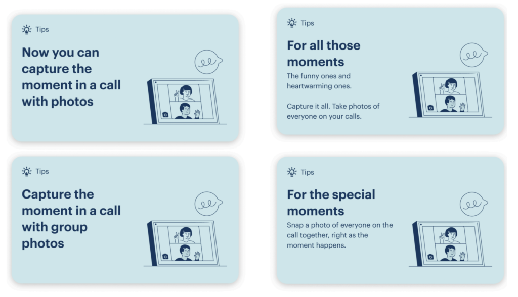
Here just a few of the many alternative approaches I had explored to the messaging, along with some of my brainstorming:




I also guided the illustrator from this, which did not show the value of this photo feature…

To this…
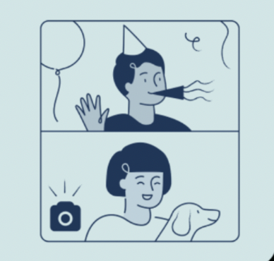
The visual should convey the key value prop of these photos. I tried to nudge the illustrator to show a more spontaneous, “in the moment” visual that really makes the instantaneous, hands-free in-call photo a valuable tool, but they had landed on the one here because we were limited in what illustrations we had copyrights to. This visual works as it shows people together on the call, equally in the photo, without any screen components cluttering the photo.
Align XFN on the objective of the QP content.
Since this is a more complex technology that needs to convey both WHAT is this and HOW to use it, the team agreed this is too big of a job for just a QP card. We decided to drive to a slideshow to educate new users. (In other cases, the feature and QP message were more straightforward and we could just drive to the app directly from the card.)
A key consideration I brought up to the team was where we’d drive users once they finish this slideshow. Since users have to be on a call to try the feature, the best we could do to bring users into the experience at the end of the slideshow was to drive them to their contacts page, where they can start the call. However, it is unlikely users will be in the mood to make a call right at that moment, and it’s very unpredictable whether their contact would answer the call. Also, the device home screen already lists their top contacts, so the team decided to simply return users to Home. We considered offering 2 CTAs for both options, but the slideshow design standard only allows for 1 CTA.
We leveraged the slideshow to both educate users on how to use the features, and build excitement about trying it out soon. So tapping on the card triggered the following NUX slide show, which concisely explained what the feature is and how to use it.
The slideshow content, visuals, and UX had just as much thought and collaboration as the QP card. I am happy to dive into more details on a call!
[Tapping the QP card opened this NUX slideshow]


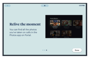
Tapping on “Done” closes the slideshow and brings users back to the home screen, where they also see a list of their top contacts who they could call. Ideally users would feel compelled to try the new feature right then and there. But if not, that’s okay because we accounted for this in the design of the slideshow.
RESULTS:
This was one of the highest performing QP cards, with high click through rates and significant increase in in-call capture use as well as voice assistant use–causing impact across multiple teams and features. This was one of the QP cards that had validated and established my process and standards for QP cards moving forward.
FUTURE THINKING
Before Portal was deprecated, I had a number of recommendations for ways to keep improving the feature and user discoverability, i.e.

I also recommended adding first time tooltips to the roadmap for future improvements. i.e. If users haven’t tried the new photos feature yet, next time they turn on Portal they’d see a tooltip appear over their contacts list, nudging them to make a call and try it out. We’d discuss as a team the best moment to trigger this tooltip, but showing it at the start of their experience (when they turn on Portal), before users have begun any task is a good choice, so it’s not interrupting them in a flow.
Content strategy, systems thinking, information architecture, taxonomy, labels, and definitions for Quest for Business
Enable users to find and interpret the data they need to manage their devices, apps, and people.
WHAT:
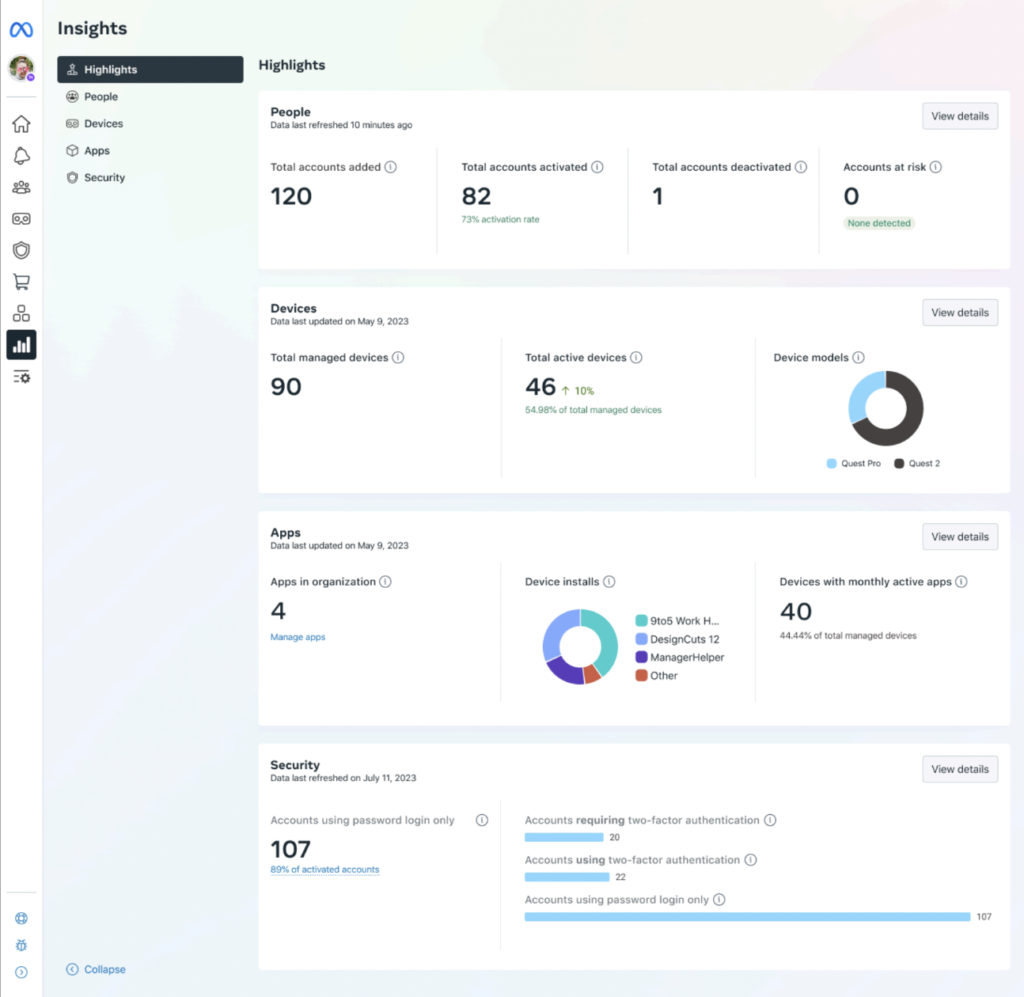
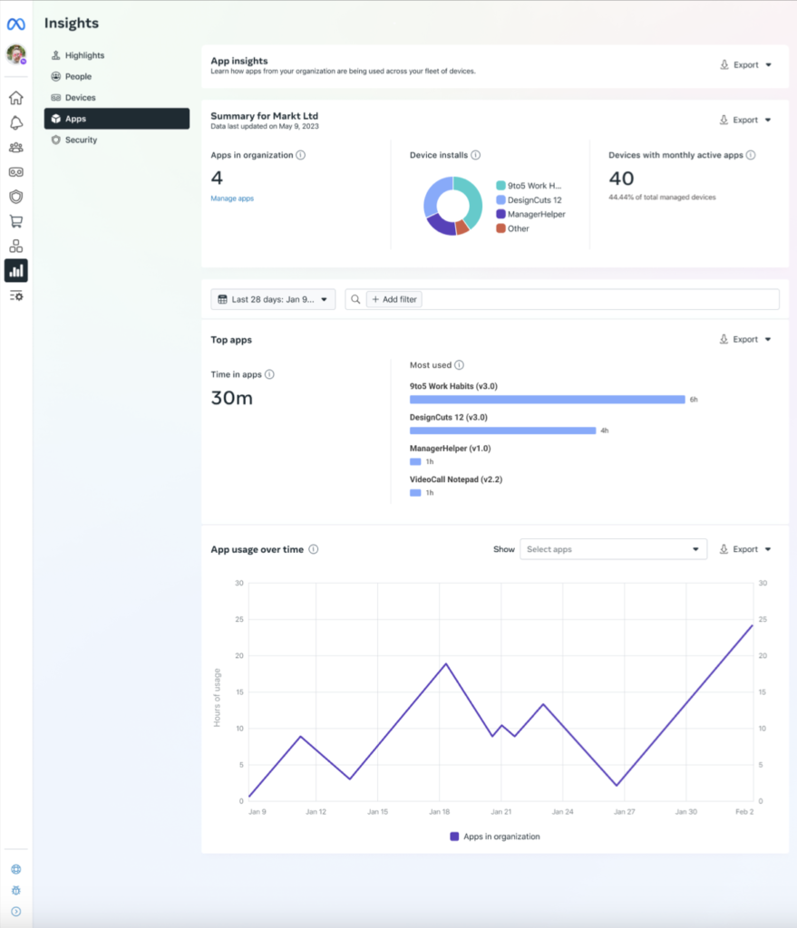
I led content design for Device Insights within Admin Center, the web product that organizations use to manage their Meta devices (Quest headsets). Through this work, I brought a strategic POV for the way we organize and structure device insights, which should maintain continuity across People, Devices, Apps, and Security metrics. Insights already existed for other teams, but not for Devices. So it was a balance of creating something new while maintaining consistency with what already existed, and pushing for improvement across all insights.
Partners: I worked closely with product design, engineering, user research, product management, data science, legal, localization/translators, and content design across other teams.
PROBLEM:
Device admins needed to see the ROI on the purchase of Meta Quest headsets, and to make sure their devices were being used in the most efficient and secure ways by their organization.
RESULTS:
Influenced strategic approach to device insights and aligned XFN.
Reduced risk of shipping inaccurate and misleading metrics.
Shipped new product, drove UX quality across product areas, and enabled admins to effectively manage their fleet of devices, track ROI, and ensure devices were being used effectively and securely.
PROCESS:
As always, I began by meeting with my XFN partners, asking critical questions, and making sure I understand the user and use case, the problem, how this product addresses the problem, and what is unique in our solution compared to our competitors.
I audited the original app metrics and uncovered some problems:
● Inconsistencies in the metric types we show
● The team did not understand many of these metrics (i.e. is this measuring per app or for all apps? Per device or all devices? Totals or averages?)
● We did not have a complete PRD outlining this information
In the absence of this fundamental context, I worked closely with ENG to clarify how we collect the data and what each metric represents (i.e. is it the number of apps or number of app installs across all devices? Which activity is it tracking, for which devices/entities, over what time?). This informed my decisions for the user-facing metric definitions I wrote, which were concise, accurate, and simple. This also built important internal knowledge, unblocked CD, PD, and then ENG, and moved the project forward.
I worked closely with product design to think through the UX, the hierarchy of all the metrics, and how we organize all these different types of insights. At first, PD had crafted several different insights pages that all seemed to show the same data (Highlights page, Overview page, main Insights page). I posed the question: “What is the unique value of each of these pages, or are they repeating the same information? We decided to consolidate some of these pages and developed clear rationale behind each page, which metrics appear, and the order or structure of each metric.
I aligned with content designers on related teams to ensure consistency in language and design. I synced with legal to ensure all legal concerns were addressed. I pushed for UXR opportunities to test user comprehension and sentiment on language, as well as the UX flow and interactions. And, of course, I worked with my product designer through the entire process as we thought through different approaches and iterated toward a final solution.


Promotion and education for a new Portal app: a quick summary
Test and develop messaging that boosts discoverability and new habit formation for users.
I led content design for the release of the Calendar app, exploring different approaches to the messaging.
Though the “Keep your day on track” concept is one of the longer alts, the team preferred this approach because it led with the value prop without overpromising what this app could do at the time. It instantly spoke to the key benefits of: 1) syncing both work and personal calendars, underscoring how this device enables users to manage all aspects of their lives, 2) the ease of seeing and joining calls/events “right from the home screen.”
I’ll be adding notes in the near future about the various parameters and considerations, and XFN alignments on this work.

Some alt messaging approaches I had explored:

(“Set up” would be 2 words)
